Guiding a Player Without an Arrow
I spent three weeks last year trying to build a simple dungeon for my own project, only to realize I was fighting a losing battle against my own assets. I kept adding massive, glowing pillars and ridiculous neon signs, thinking that’s how you teach a player where to go. But I was wrong; I wasn’t designing, I was screaming at the player. Most tutorials will tell you that level design is about lighting or color theory, but they miss the point of how level design guides players in a way that actually feels like agency. If you have to use a giant, floating golden arrow to show someone the exit, you haven’t designed a path; you’ve just built a glorified hallway that treats your audience like they’re playing with their eyes closed.
I’m not here to give you a lecture on aesthetic composition or how to use expensive shaders to draw the eye. I want to talk about the subtle, often invisible decisions that dictate whether a player feels like an explorer or a tourist on a guided bus tour. We’re going to look at the psychology of friction and how to use the environment to whisper directions instead of shouting them. I’ll show you what I learned the hard way while building my own messy, broken worlds, so you don’t have to waste your time building maps that players just end up ignoring.
Table of Contents
Visual Wayfinding as a Subconscious Directive
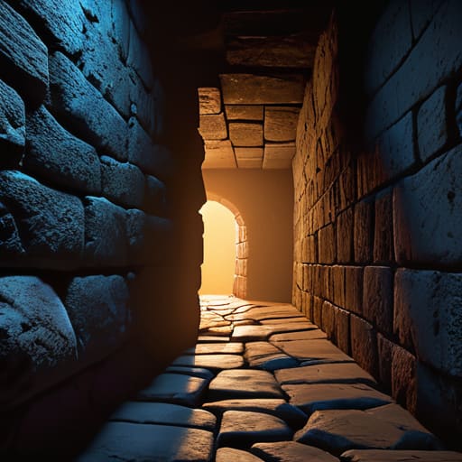
Most players think they’re exploring, but in a well-built level, they’re actually being herded. You don’t notice it because it feels like your own agency, but you’re reacting to navigational cues in 3D spaces that were placed there months before you even downloaded the build. If I’m designing a dungeon, I’m not just making a cool-looking cave; I’m using lighting and color theory in game environments to create a breadcrumb trail. A flickering torch in a dark hallway or a single, warm lamp near a doorway isn’t just “atmosphere”—it’s a command. It’s the designer saying, “Go here, because the alternative is a boring wall or a death trap.”
The real magic happens when you use architecture to narrow the player’s focus without them feeling claustrophobic. I’ve seen too many devs try to force movement with invisible walls, which is the loudest, most annoying way to tell a player they’re wrong. Instead, you use guiding player attention through architecture. A slightly wider archway or a path that naturally curves toward a silhouette on the horizon does the work for you. You aren’t fighting the player’s instinct to wander; you’re just making the “right” path the most psychologically rewarding one to follow.
The Deception of Guiding Player Attention Through Architecture
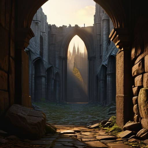
The real trick isn’t just pointing a player toward a door; it’s making them feel like they discovered it themselves. When a designer uses guiding player attention through architecture, they are essentially running a psychological shell game. You see a massive, crumbling cathedral in the distance, and your brain immediately flags it as a destination. You didn’t choose to go there because of a waypoint marker; you chose it because the scale of the geometry forced your eyes upward. This is where the deception starts. If the architecture is too loud, it feels like a guided tour in a museum; if it’s too quiet, the player wanders aimlessly, loses momentum, and—this is the part that kills games—eventually closes the client.
The most effective way to manipulate this is through subtle navigational cues in 3D spaces that feel like natural consequences of the world. Think about a narrow, debris-choked alleyway that opens up into a wide, sunlit plaza. The transition isn’t just a change in scenery; it’s a rhythmic beat in a sentence. The squeeze creates tension, and the release provides relief. When we use these structural shifts, we aren’t just moving a character from point A to point B; we are managing the player’s dopamine loop without them ever seeing the wires.
Five Ways to Stop Treating Level Design Like a Map and Start Treating It Like a Conversation
- Don’t just build a path; build a reason to walk it. If a player moves from Point A to Point B solely because a floating golden arrow told them to, you haven’t designed a level, you’ve designed a chore. You want them to see a distant, glowing spire and think, “I need to get there,” not “The UI is telling me to go north.”
- Master the art of the “Negative Space.” Sometimes the best way to guide a player isn’t by showing them where to go, but by making the wrong directions feel intentionally claustrophobic, dark, or unrewarding. If the main path feels wide and bathed in warm light, the player will naturally avoid the cramped, shadowy alleyway—even without a single “No Entry” sign.
- Use environmental storytelling to create “Micro-Objectives.” A bloodstain leading toward a cracked door is a sentence that says, “Something happened here.” It competes with the player’s desire to just grind mobs by offering them something much more valuable: curiosity. If you don’t leverage curiosity, you’re just forcing them to follow a breadcrumb trail.
- Watch out for “Visual Noise Fatigue.” If every corner of your map is packed with high-contrast assets and glowing loot, you aren’t guiding anyone; you’re just screaming at them. When everything is highlighted, nothing is important. You have to give the player’s eyes a place to rest so that when you finally do use a light source to signal a path, it actually carries weight.
- Test for the “Rebel Player.” Every MMO has them—the players who spend three hours trying to climb a mountain that was clearly meant to be a barrier. Instead of building invisible walls that feel like a slap in the face, design your geometry to make those “wrong” paths feel like a choice. If they break your intended flow, make sure they at least feel like they’re exploring, not just fighting your engine.
The Ghost in the Machine
At the end of the day, level design isn’t about making a pretty map; it’s about managing the player’s cognitive load so they don’t feel like they’re fighting the UI with their feet. We’ve looked at how light sources act as silent breadcrumbs and how architecture can subtly manipulate your sense of direction without ever triggering a waypoint marker. When a designer gets this right, the player feels like a genius for finding the secret path, even though that path was essentially a scripted inevitability. If the level design is working, you aren’t thinking about the geometry at all—you’re just playing the game. But if it fails, you aren’t a hero; you’re just a person staring at a wall, wondering why the “epic quest” feels like a chore.
As I sit here staring at my own half-finished project, trying to figure out why my players keep walking into a dead-end mountain instead of through the canyon gate, I’m reminded that every ledge and every shadow is a choice. You aren’t just building terrain; you are writing a conversation between the game and the person holding the controller. Don’t just build a space for players to exist in—build a space that demands a reaction. Whether you’re a solo dev or a studio lead, remember that the most powerful tools in your kit aren’t the high-poly assets, but the quiet, invisible ways you guide a player toward the experience you intended them to have.
Frequently Asked Questions
If level design is constantly "whispering" directions to the player, at what point does it stop being helpful guidance and start feeling like a lack of agency?
It stops being guidance the second the player feels like they’re being played rather than being helped. There’s a fine line between a “nudge” and a “railroad.” If I use lighting to lead you toward a quest giver, that’s a helpful sentence. But if I use invisible walls or overly narrow corridors to stop you from exploring, I’m no longer talking to you—I’m shouting orders. When the player realizes the “path” is actually a leash, they stop playing the game and start fighting the designer.
How do designers balance these subconscious cues with the need for player exploration without making the world feel like a glorified hallway?
You balance it by giving the player a choice between two different “right” answers. If there’s only one path lit up by a golden trail, you’re not designing a world; you’re designing a hallway with high-res textures. But if you place a landmark in the distance—a glowing tower or a strange silhouette—you aren’t forcing a direction. You’re offering a destination. The player feels like they’re exploring, even if you’ve already calculated exactly where they’ll land.
Can these same architectural tricks be used to manipulate player behavior in ways that actually harm the game's economy or social structure?
Absolutely. If you use architecture to funnel players into specific zones, you aren’t just guiding them; you’re creating bottlenecks. You might accidentally create “hotspots” that facilitate hyper-efficient botting or, worse, drive all the high-level players into a single corridor, making social interaction feel like a crowded subway rather than a world. When your level design dictates where the gold flows, you aren’t just designing a path—you’re accidentally drafting the game’s entire economic blueprint.

