
Thumbnails That Are Honest and Still Get Clicked
Stop treating your YouTube metadata like some mystical math equation that requires a PhD in data science to solve. I see these “growth gurus” peddling expensive courses claiming that if you just tweak your saturation by 5% or add a red arrow, you’ve mastered how thumbnails and titles work. It’s nonsense. In my experience building a game from scratch, I’ve learned that a thumbnail isn’t just a graphic; it’s a mechanical prompt. If your title promises a high-level raid strategy but your thumbnail is just a blurry screenshot of a loot drop, you aren’t “optimizing”—you’re just lying to your players. You’re teaching your audience that your content is a broken questline, and they aren’t going to stick around to see if you fix it.
I’m not here to give you a checklist of “hacks” that expire in two weeks. I want to talk about the intent behind the click. I’m going to break down the actual psychology of the decision-making process, explaining why certain visual cues act as a contract with the viewer and why others feel like a scam. We’re going to look at how thumbnails and titles work as a unified system of communication, so you can stop guessing and start building an actual connection with your audience.
Table of Contents
Visual Storytelling in Video the Silent Command
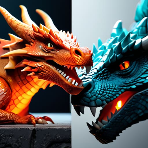
Think about a boss fight in an MMO. If the developer shows you a massive, glowing dragon in the trailer, they are making a promise. But if the actual fight is just a tiny sprite in a dark room, that promise is broken. Thumbnails function the exact same way through visual storytelling in video. When you design a thumbnail, you aren’t just making a pretty picture; you are setting the expectations for the entire experience. If your image is a chaotic explosion of colors and high-contrast effects, you’re telling the viewer, “This is a high-octane, high-intensity moment.” If you use a single, lonely character against a vast landscape, you’re signaling something atmospheric and slow.
The danger is when the visual language contradicts the actual content. This is where the line between clickbait vs click-worthy gets blurred. A clickbait thumbnail is a lie—it’s a designer telling the player there’s a legendary loot drop at the end of a dungeon, only for them to find a pile of gray junk. It might get you a momentary spike in engagement, but you’ve just poisoned your relationship with the audience. You’ve taught them that your “sentences” are unreliable. Real visual storytelling doesn’t trick the viewer; it prepares them for the reality of the video.
The Psychology of Viewer Engagement and the Promise

When you look at a thumbnail, your brain isn’t just processing colors; it’s performing a rapid-fire cost-benefit analysis. You’re asking, “Is the potential dopamine hit of this video worth the investment of my time?” This is the core of the psychology of viewer engagement. A creator isn’t just showing a scene; they are making a contract. If the title promises a high-stakes raid boss encounter but the thumbnail is just a static shot of a character standing in a field, you’ve broken that contract before the video even starts. You haven’t just failed at metadata optimization; you’ve signaled to the viewer that your content is unreliable.
The fine line between clickbait vs click-worthy comes down to the integrity of that promise. Clickbait is a lie—it’s a system designed to extract a click through deception, which inevitably destroys your long-term retention. Click-worthy content, however, uses the thumbnail to set the stakes. It’s about framing the tension. If I see a thumbnail of a player with 1% health facing a dragon, I’m not clicking because I’m being tricked; I’m clicking because the visual storytelling in video has successfully communicated a specific, high-tension moment that I want to see resolved.
The Designer’s Cheat Sheet: Making Sure Your Promise Doesn't Break the Player
- Treat your thumbnail as the game’s UI; if the visual information is cluttered or nonsensical, the viewer’s brain will treat the video like a broken menu and click away before the first frame even loads.
- The title isn’t a description, it’s a mechanical prompt; don’t tell me what happens in the video, tell me what the viewer is supposed to feel or achieve by watching it, much like a quest objective.
- Avoid the “Loot Box” trap of clickbait; if your thumbnail promises a legendary drop but the video is just a slow walk through a forest, you haven’t just disappointed them, you’ve taught their brain that your content is a low-value grind.
- Understand the competition for the eye; your thumbnail isn’t fighting your other videos, it’s fighting the high-saturation, high-contrast “boss fights” of the YouTube sidebar, so if your design is too subtle, it’s essentially a stealth build in a loud room.
- Align the “Visual Sentence” with the “Textual Sentence”; if your title implies a high-stakes struggle but your thumbnail shows a calm, static menu, you’ve created a mechanical dissonance that makes the viewer feel like the game is lagging.
The Cost of the Lie

At the end of the day, a thumbnail and a title aren’t just marketing tools; they are the first mechanical systems a viewer interacts with. If your title promises a high-stakes raid but your thumbnail is just a zoomed-in shot of your character’s face, you haven’t just optimized for clicks—you’ve issued a command that you have no intention of fulfilling. When the reality of the video fails to match the implied contract of the packaging, you aren’t just losing a view; you are teaching the viewer that your content is a broken promise. You’re essentially building a game where the tutorial lies about the mechanics, and eventually, nobody is going to show up for the launch.
I’ve spent enough time staring at dead MMO servers to know that players don’t leave because a game is hard; they leave because they feel cheated by the systems meant to guide them. Treat your metadata with that same respect. Stop thinking about “optimizing CTR” as a math problem and start seeing it as a design choice. When you align what you show with what you actually deliver, you aren’t just getting a click; you are building a foundation of trust that carries a viewer from a single video into a long-term community. Design your “sentences” with intention, and make sure they actually mean what they say.
Frequently Asked Questions
If I change my thumbnail to something more "clicky" but it doesn't match the actual gameplay, am I just creating a mechanical friction that will kill my retention later?
You aren’t just creating friction; you’re issuing a false command. If your thumbnail promises a high-stakes boss fight but the video is actually a slow-burn tutorial, you’ve told the player to prepare for adrenaline and then handed them a lecture. That’s a broken loop. You might win the click, but you’ve poisoned the retention. Once a viewer realizes your “sentence” was a lie, they won’t just leave the video—they’ll stop listening to you entirely.
How do I balance the "sentence" I'm writing with the thumbnail without it feeling like I'm just begging for attention instead of offering a value proposition?
Think of it like a quest marker. If the marker says “Slay the Dragon” but the actual encounter is just picking herbs, you haven’t just made a mistake—you’ve broken the player’s trust. To avoid looking like a beggar, stop trying to “grab” attention and start trying to “signal” it. Your thumbnail shouldn’t be a scream; it should be a clear, honest summary of the value you’re delivering. If the thumbnail and the content are both telling the same story, you aren’t begging; you’re just being a good designer.
At what point does a title stop being a way to explain the video's hook and start becoming a grind that actually turns viewers off?
It becomes a grind the moment the title stops being a promise and starts being a tax. In game design, a grind is just a mechanic that forces you to do something boring to get to the thing you actually want. If I have to parse through “INSANE!! 😱” and twenty emojis just to figure out if you’re actually reviewing the new patch or just screaming at a menu, you’ve turned your hook into a barrier. You’re no longer inviting the player; you’re charging them an attention tax they didn’t agree to pay.

