
A Strong Style Outlives High Fidelity
I spent three months last year trying to bake realistic lighting into a single forest asset for my own project, only to realize I was just building a very expensive way to say nothing. We’ve been conditioned to believe that more polygons equals more immersion, but that’s a lie. When a studio spends their entire budget chasing photorealism, they’re writing a sentence that says “look at this” instead of “play this,” and usually, it’s a sentence that breaks the moment the hardware can’t keep up. I’ve seen AAA titles age like milk because they chased the bleeding edge, while the games I play on private servers—the ones that actually stick—rely on a cohesive vision. This is the fundamental truth of how art style beats fidelity: one creates a world you can inhabit, while the other just creates a world you have to squint at.
I’m not here to give you a lecture on rendering pipelines or vertex counts. I want to talk about the intentionality behind the visuals. I’m going to show you why a strong, unified aesthetic is a mechanical decision that frees up your player’s brain, rather than a technical hurdle that exhausts it.
Table of Contents
The Costly Lie of Stylized vs Photorealistic Graphics

When you’re building something alone, or even with a small team, every polygon you render is a debt you’re taking out against your future. Choosing photorealism is like signing a high-interest loan; you spend all your time fighting technical constraints just to make sure a character’s skin pores look “correct,” only to realize you’ve left zero budget for actual visual storytelling through art style. You end up with a game that looks like a tech demo for a year, then looks like a relic from 2015 the moment the next generation of GPUs drops.
The real trap is that photorealism is a moving target. If your goal is purely high fidelity, you’re competing directly with the massive AAA studios who have entire departments dedicated to sub-surface scattering. That’s a fight you’ve already lost. But when you lean into a strong visual identity in game design, you aren’t competing with their hardware; you’re competing with their imagination. A clever, cohesive art direction allows a game to age like a fine wine rather than a piece of rotting fruit, ensuring aesthetic longevity that survives long after the “next big thing” in ray tracing becomes obsolete.
How Art Direction and Technical Constraints Shape Reality
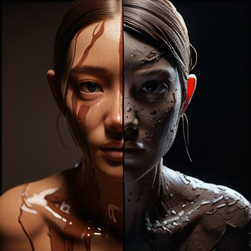
When I’m sitting in front of my engine, trying to figure out why my latest build looks like a muddy mess, I’m usually running into the same wall: I’m trying to fight the hardware instead of working with it. This is where the real magic of art direction and technical constraints happens. If you try to push for hyper-realism on a budget, you aren’t just making a hard choice; you’re making a bad one. You end up with assets that look “okay” today but look like absolute garbage in three years because the tech caught up. But when you lean into a specific look, you aren’t just saving money; you’re building a shield against time.
A strong visual identity in game design acts as a shorthand for the player. It tells them what matters. If every leaf on every tree is a high-poly masterpiece, the player’s eye has nowhere to rest. They’re just staring at a forest. But if you use a bold, painterly style, you can use color and shape to force the player’s attention toward the actual gameplay. You stop asking them to admire your textures and start asking them to read the world you’ve built.
The Designer’s Cheat Sheet: Making Every Pixel Work for You
- Stop fighting the hardware and start leveraging the limitations. When you try to push photorealism on a budget, you’re writing a sentence that says “please don’t look too closely,” which is a terrifying way to build a world. Instead, pick a strong aesthetic and use it to hide your technical seams; a well-placed shadow in a stylized world is a design choice, whereas a bad shadow in a “realistic” one is just a bug.
- Remember that visual clarity is a mechanical necessity, not a luxury. If your player can’t distinguish a boss’s telegraph from a decorative rock because you were too busy chasing sub-surface scattering on the granite, you haven’t made a beautiful game—you’ve made a frustrating one. Art style should act as a UI for the eyes, telling the player what matters and what is just background noise.
- Build for the “Long Tail” of hardware. High fidelity is a gated community; it only speaks to the players with the $3,000 rigs. A cohesive art style, however, is a universal language. If your game looks intentional on a handheld or a budget laptop, you aren’t just saving on dev costs—you’re expanding your player base by making sure the “sentence” of your game is readable by everyone.
- Consistency is more important than quality. A game where every asset is “okay” but follows a strict, unified color palette and silhouette rule will always beat a game that has one breathtakingly realistic forest surrounded by mediocre, mismatched buildings. Mismatched assets tell the player the world is a collection of files; a unified style tells them the world is a place.
- Use your art style to manage player attention, not just to decorate. Every visual element is competing with your combat loop, your loot drops, and your social systems for the player’s brainpower. If your art style is too busy or too “high-fidelity” for its own good, it’s stealing attention away from the actual gameplay. Make sure your visuals are supporting the fun, not distracting from it.
The Verdict on Visuals

At the end of the day, high fidelity is just a way of shouting at the player to notice how much money you spent on shaders. When you prioritize photorealism over a cohesive art direction, you aren’t building a world; you’re building a technical showcase that starts decaying the second a new GPU hits the market. I’ve seen countless indie projects die because they tried to chase a level of detail they couldn’t sustain, and I’ve seen AAA titles feel dated within three years because they lacked a soul. A strong art style is a sentence that says, “This is how this world works,” whereas high fidelity is often just a sentence that says, “Look at how much we can render.“
If you’re building something—whether it’s a massive MMO or a tiny solo project like mine—stop asking if it looks real and start asking if it looks intentional. Realism is a moving target that you will eventually lose, but a distinct aesthetic is a permanent contract between you and the player. Don’t let your design budget get swallowed by the pursuit of a perfection that doesn’t actually improve the gameplay loop. Build something that has a voice, something that stays in the player’s head long after they’ve turned the console off, and remember that style is the only thing that actually scales.
Frequently Asked Questions
If stylized art is so much more efficient, why are big studios still pouring hundreds of millions into photorealism?
Because big studios aren’t just making games; they’re making “prestige products.” When a AAA studio drops $200 million, they aren’t just competing with other games—they’re competing with Netflix and Hollywood for your eyeballs. Photorealism is a massive, expensive sentence that says, “We are a high-end tech company.” It’s a marketing flex designed to justify a $70 price tag to shareholders, even if that fidelity actually ends up getting in the way of the gameplay.
How do you decide when a game's art style is actually helping the gameplay versus when it’s just a pretty distraction that masks bad mechanics?
You look at the cognitive load. If I’m in a high-stakes raid and a gorgeous particle effect obscures the telegraph for a boss’s slam, that art isn’t “beautiful”—it’s a mechanical failure. Good art style serves the readability of the game’s systems; it highlights what matters. If the visual language is fighting your ability to make informed decisions, the designer isn’t making a masterpiece, they’re just building a very expensive distraction.
At what point does a "stylized" look stop being a smart design choice and just start looking like a budget constraint that players won't forgive?
It stops being a choice when the style stops communicating anything about the world and starts feeling like a lack of effort. If your art style is “low-poly” because it’s a deliberate aesthetic, that’s a sentence about minimalism. But if it’s low-poly because you couldn’t afford a decent texture artist, the sentence becomes “we ran out of money.” Players can sense that. When the style stops being a tool to guide their attention and starts being a barrier to immersion, you’ve crossed the line.

