
Colourblind Modes That Actually Work
I spent three hours last night staring at a raid boss’s health bar, trying to figure out if the glowing red indicator meant “get out of the fire” or if I was just staring at a muddy brown smear. It’s a classic failure of visual language, and frankly, it’s infuriating. Most developers treat accessibility like a checkbox at the end of a sprint, throwing a generic post-processing filter over the camera and calling it a day. But if you actually look at how colourblind modes are implemented, you realize that a simple saturation shift isn’t a solution; it’s a band-aid on a broken sentence. When a designer relies solely on hue to communicate danger, they aren’t just being lazy—they are silencing the player by making the game’s most vital instructions unreadable.
I’m not here to give you a lecture on engine-level shaders or academic accessibility standards. Instead, I want to pull back the curtain on the actual mechanics of these systems—from texture swapping to icon redundancy—and explain why most implementations fail the moment the screen gets chaotic. I’ll show you what it looks like when a designer actually listens to the visual dialogue they’re creating, and more importantly, how you can avoid building a game that accidentally mutes its own players.
Table of Contents
The Color Matrix Transformation Correcting the Designers Mistake

When you actually look under the hood, you realize that most developers aren’t manually repainting every single texture in the game—that would be a death sentence for a solo dev or even a mid-sized studio. Instead, they use a color matrix transformation. Think of it like a real-time translation layer sitting between the game engine and your monitor. The engine spits out its intended colors, but before they hit your eyes, the matrix intercepts them and mathematically shifts the color values. It’s a way of remapping the spectrum so that a specific shade of red that would normally vanish for someone with protanopia is shifted into a wavelength they can actually distinguish.
The problem, though, is that this isn’t a magic wand. If your original UI design for color blindness was lazy—say, you relied entirely on red and green health bars without any icons or shapes—a matrix transformation can only do so much. You can shift the hues all you want, but if the underlying visual language is “color-only,” the sentence is still broken. You aren’t just shifting pixels; you’re trying to ensure the functional meaning of the color survives the translation.
Visual Accessibility Standards and the Lies of Rgb
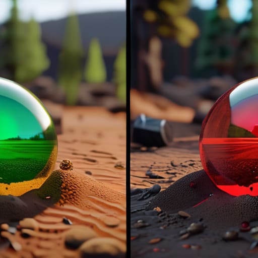
The problem with relying on standard RGB values is that developers often treat color as an absolute truth rather than a variable. We’re taught in basic design that red means “danger” and green means “go,” but if you’re playing with deuteranopia, that sentence just becomes a muddy, indistinguishable mess of yellows and browns. When a dev builds a UI without considering this, they aren’t just making a visual error; they are effectively deleting critical information from the player’s screen. They are telling the player, “If you can’t see this specific hex code, you shouldn’t be playing this game.”
This is why we can’t just “fix it in post” with a simple filter. True visual accessibility standards require us to stop thinking about colors as static identities and start thinking about them as functional signals. If a health bar relies solely on a red-to-green gradient to communicate status, the designer has failed the fundamental test of clarity. You have to bake redundancy into the system—shapes, patterns, or icons—so that even when the color matrix fails, the intent of the mechanic remains loud and clear.
The Implementation Checklist: Making Sure the Sentence Actually Makes Sense
- Stop relying on color alone to convey meaning. If your UI says “Critical Health” only by turning the border red, you haven’t built a colorblind mode; you’ve built a barrier. The most effective implementation is adding a secondary signifier—an icon, a texture change, or a pulsing animation—so the player isn’t just guessing based on hue.
- Don’t just swap the palette; check the contrast. A lot of devs think they can just run a shader over the whole screen to shift reds to greens, but if the new green has the same luminance as the background, you’ve just traded one problem for a different kind of blindness. You have to ensure the “sentence” remains legible by maintaining a high contrast ratio between the foreground and the background.
- Test against the big three, not just a single filter. Protanopia, deuteranopia, and tritanopia aren’t just “different ways of seeing”; they are distinct shifts in how color relationships function. If your implementation only works for red-green deficiency but breaks your game for someone with blue-yellow issues, you haven’t implemented a mode—you’ve just moved the goalposts.
- Avoid the “Post-Processing Trap” where you wash out the entire game’s aesthetic. If you apply a heavy color-correction filter to the whole world just to make a single loot drop visible, you’re sacrificing the game’s visual identity for a patch job. The goal is to target the specific elements that carry information, rather than nuking the entire color space.
- Give the player the steering wheel. Every “one-size-fits-all” colorblind toggle is a gamble on what the player actually needs. The smartest way to implement this is through granular sliders or presets that allow the player to decide which specific color channels are causing the most friction in their specific experience.
The Final Sentence

At the end of the day, implementing a colorblind mode isn’t just about swapping out a shader or running a matrix transformation on the final frame buffer. It’s about acknowledging that the visual language you built might be illegible to a huge chunk of your audience. If your combat feedback relies entirely on a red health bar and a green mana bar, you haven’t just made a color choice; you’ve written a sentence that says, “If you can’t see this specific wavelength, you aren’t invited to the fight.” We’ve seen how the math works and how the RGB lies can trip up even the best-intentioned engines, but the technical fix is only half the battle. The real work is ensuring that the core intent of the game’s visual cues survives the translation.
As I sit here staring at my own messy code, trying to get a single sprite to behave, I realize that accessibility shouldn’t be a patch we slap on at the eleventh hour to check a box. It has to be part of the initial conversation. When we design with these constraints in mind from the start, we aren’t just fixing a broken sentence; we are learning to speak a much clearer, more universal language. A game that is playable by everyone isn’t just “inclusive”—it is fundamentally better designed. We owe it to the players to make sure that when we speak through our mechanics and our art, everyone is actually able to hear what we’re saying.
Frequently Asked Questions
If a developer uses a global color matrix filter to fix everything at once, how much of the original art direction and "mood" are they actually sacrificing?
You’re basically asking if we can fix a bad sentence by just shouting it louder. When a dev slaps a global matrix filter over everything, they aren’t “fixing” the art; they’re overwriting it. You lose the subtle color grading, the intentional shadows, and that specific atmospheric “mood” that separates a masterpiece from a generic asset flip. It’s a blunt instrument. It solves the visibility problem, sure, but it often kills the soul of the visual language in the process.
Is it better to rely on these engine-level color shifts, or should designers be building redundant visual cues—like shapes or patterns—directly into the UI from the start?
If you’re relying solely on an engine-level color shift, you’re essentially trying to fix a typo by changing the font. It might make it legible, but the sentence is still fundamentally broken. An engine-level filter is a safety net, not a design philosophy. Real accessibility means building redundancy into the DNA of the UI—using shapes, patterns, or icons alongside color. If a player can’t tell a health bar from a mana bar without color, your design has already failed.
At what point does a colorblind mode stop being an accessibility feature and start becoming a "band-aid" for a game that has fundamentally poor visual communication?
It stops being an accessibility feature the moment you’re using it to compensate for bad art direction. If I can’t tell a health bar from a mana bar without a filter, that’s not a vision impairment issue—it’s a design failure. A true accessibility mode should enhance clarity; a band-aid just tries to salvage a mess. If your gameplay loop relies on color-coded cues that aren’t reinforced by shape, texture, or UI position, you haven’t built a system; you’ve built a riddle.

