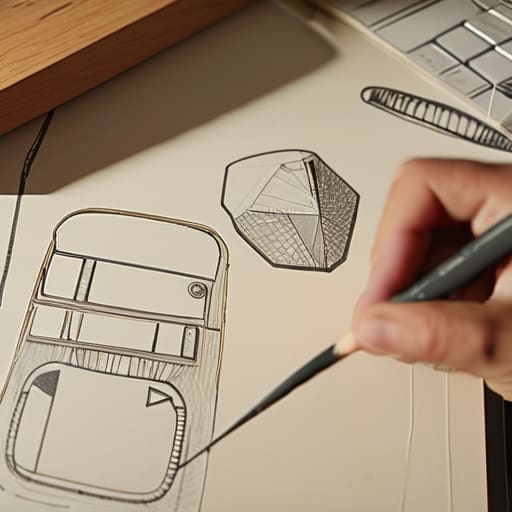
Making a Game Look Deliberate With No Art Training
I spent three months trying to force myself into a Blender tutorial because I thought my game looked like a collection of sentient geometric shapes. I was convinced that if I couldn’t render a realistic leather texture or a convincing human face, I was essentially failing at game design. But that’s the lie the industry sells us: that visual fidelity is the only way to communicate value. In reality, obsessing over assets you can’t create is just a way to avoid the harder work of building systems that actually function. Learning how to work with limited art skills isn’t about finding a “good enough” way to fake it; it’s about realizing that your lack of an art degree is actually a design constraint that can force you to be more clever than the AAA studios.
I’m not going to give you a list of asset packs or tell you to go buy a drawing tablet. Instead, I want to talk about how to use visual simplicity to reinforce your game’s core loop. I’ll show you how to lean into abstraction, how to use color theory to replace detail, and how to ensure your mechanics don’t get buried under a mountain of unpolished assets. This is about making intentional choices, not just making excuses.
Table of Contents
Stylized Art Techniques for Non Artists and Their Costs
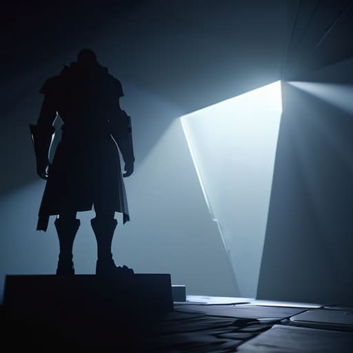
When you can’t draw a realistic face, you have two choices: keep trying to fail at realism, or lean into abstract art as a design choice. I spent months trying to make a 3D character model look “human” only to realize it looked like a melting candle. That was a massive waste of dev time. Now, I treat my lack of skill as a constraint that forces clarity. If I use low-poly shapes or heavy silhouettes, I’m not just “getting by”—I’m telling the player exactly what a threat looks like without needing a 4K texture to do the heavy lifting.
The real danger, though, is the trap of using stock assets in game design as a crutch rather than a tool. It’s tempting to grab a bunch of high-fidelity assets from a marketplace to hide your lack of talent, but you end up with a “Frankenstein engine” look. When your player character looks like a Blizzard asset and your environment looks like a generic mobile game, the visual language breaks. You aren’t just saving time; you’re creating cognitive dissonance that pulls the player out of the loop. You have to ensure every asset, no matter how cheap, says the same thing.
Using Stock Assets in Game Design Without Losing Soul
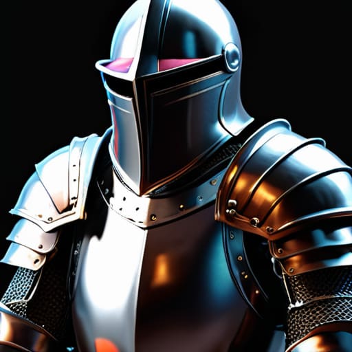
The temptation to grab a pack of high-fidelity assets from a marketplace is real, especially when you’re staring at a blank Unity scene and feeling like a fraud. But here’s the trap: if you just drop a hyper-realistic knight into a world of generic forest trees, you haven’t built a game; you’ve built a collage. The moment you start using stock assets in game design without a cohesive plan, you’re telling the player that your world doesn’t actually exist. You’re communicating a lack of intent. It’s the visual equivalent of a developer trying to patch a broken economy by just throwing gold at the players—it feels hollow because it lacks a structural foundation.
To avoid this, you have to treat assets like ingredients in a recipe rather than the meal itself. You need a unifying constraint. If you can’t match the fidelity, you change the rules. This is where abstract art as a design choice becomes your best friend. Instead of trying to make a mediocre 3D model look “real,” lean into its geometry. Use lighting, post-processing, or a strict color palette to force those mismatched assets into the same conversation. You aren’t hiding your lack of skill; you’re curating a vibe that makes the asset’s limitations feel like a deliberate aesthetic decision.
The Systems-First Survival Guide
- Lean into visual constraints as a gameplay mechanic. If your character models look like primitive blocks, don’t pretend they’re heroes; make the game about being a geometric entity in a digital void. When you stop fighting your lack of fidelity and start making it a “choice,” you stop competing with AAA graphics and start competing with pure abstraction.
- Use lighting to hide what you can’t draw. I’ve learned that a poorly modeled asset in a dark, atmospheric corridor feels like “intentional mood,” whereas that same asset in a brightly lit field feels like a “technical failure.” Light is the cheapest way to tell the player where to look and what to ignore.
- Prioritize UI consistency over asset quality. You can get away with a lot if your menus, buttons, and font choices feel cohesive. A player will forgive a low-poly tree if the interface feels responsive and professional, but they will never forgive a beautiful sprite that lives inside a clunky, mismatched UI.
- Let the soundscape do the heavy lifting for your eyes. If you can’t animate a complex sword swing, make sure the clink of the metal and the whoosh of the air sound incredibly satisfying. Sound fills the gaps that your art skills leave behind, and it’s much easier to find a great SFX pack than it is to learn Blender.
- Build a “Visual Language” instead of a “Visual Gallery.” Stop trying to make every single object look good. Instead, decide that everything in the “forest” category has a specific color palette and a specific level of detail. If you’re consistent with your limitations, players will stop seeing “bad art” and start seeing a “style.”
The System is the Soul
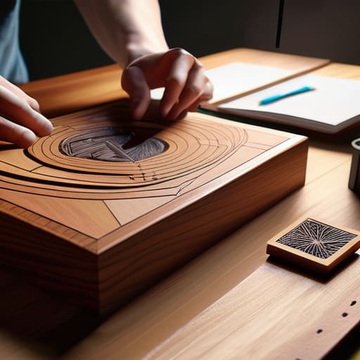
At the end of the day, whether you’re leaning into heavy stylization to hide a lack of anatomy or carefully curating stock assets so they don’t feel like a mismatched pile of junk, you’re making a choice about how much cognitive load you’re placing on the player. You can’t hide behind high-fidelity textures if your core loops are broken, and you can’t save a boring game with a beautiful art style. If you use a low-poly aesthetic, you aren’t just “saving time”—you are telling the player that clarity and readability matter more than realism. Every shortcut you take is a design decision that either streamlines the experience or creates a layer of visual noise that players have to fight through.
Don’t let the fear of a blank canvas or a bad drawing stop you from shipping. I’ve spent years watching developers stall out because they were chasing a level of polish they couldn’t afford, effectively turning their lack of art skills into a sentence of stagnation. Your job isn’t to be a master painter; it’s to be a coherent architect. If the systems are tight and the visual language is consistent, players won’t care that your trees look like green cones. They’ll care that the world makes sense. Build the logic first, and let the art be the way you communicate that logic to the world.
Frequently Asked Questions
If I lean too hard into a stylized aesthetic to hide my lack of skill, am I just creating a new kind of visual debt that I'll have to pay off later when I want to expand the game?
Absolutely. You’re essentially taking out a high-interest loan. If you lean on a hyper-specific “cheap” style—like heavy outlines or extreme low-poly—you’re betting that your entire game can live in that narrow box. The second you want to add a complex boss or a new biome that doesn’t fit that specific visual shorthand, the seams will rip wide open. You haven’t solved the art problem; you’ve just narrowed your design scope until it’s a cage.
At what point does using stock assets stop being a "clever design sentence" and start becoming a signal to players that the game is just a cheap asset flip?
It stops being a clever sentence the moment the assets stop talking to each other. If your hero is a high-fidelity fantasy knight but your trees look like they were ripped from a mobile RTS, you aren’t designing; you’re just collecting. Players don’t mind stock assets, but they hate visual dissonance. When the assets compete for attention instead of supporting the world, you aren’t telling a story—you’re just signaling that you stopped caring halfway through.
How do I make sure my UI and menus don't feel like a disconnected layer of "good" art sitting on top of "bad" gameplay assets?
The mistake most people make is treating the UI like a separate project, like a sticker you slap on a notebook. If your game is gritty and lo-fi, but your menus are clean, vector-based Material Design, you’ve just told the player the world ends at the edge of the screen. You have to make the UI part of the same sentence. Use the same color palettes, the same rough edges, or even the same “bad” textures. If the UI feels too polished, it’s not a bridge; it’s a barrier.

