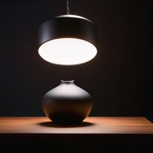
One Lamp in the Right Place Beats Three in the Wrong One
I remember sitting in my bedroom at 3:00 AM, staring at a scene I’d spent three weeks building, only to realize that despite the high-poly assets and the custom textures, the whole thing felt utterly dead. I had all the technical settings dialed in, but I hadn’t actually figured out how to set up lighting that communicated anything to the player. Most tutorials will tell you how to manipulate lumens or bake shadows like you’re performing a math equation, but they miss the point: lighting isn’t about visibility, it’s about directing intent. If you light a room perfectly evenly, you aren’t being “clear”; you’re telling the player that every single corner of that room is equally important, which is a lie that leads to visual fatigue and zero focus.
In this guide, I’m going to skip the academic fluff and show you how to use light as a tool for narrative hierarchy. We aren’t just clicking buttons in an engine; we’re learning how to use contrast to force the player’s eyes toward the door they need to open or the item they need to loot. I’ll walk you through the practical logic of placement, color temperature, and shadow depth so you can stop guessing and start commanding attention.
Table of Contents
Guide Overview
Tools & Supplies
- Measuring tape for distance calculation
- Step ladder for overhead placement
- Key light 1 unit
- Fill light 1 unit
- Backlight 1 unit
- Light stands 3 units
- Softbox or diffuser 1 unit
Step-by-Step Instructions
- 1. Start with a total blackout. I know, it feels counterintuitive, but if you start with a dozen lights turned on, you aren’t designing a scene; you’re just managing a mess. Kill every light source in your engine until the player is staring into a void. You need to know what the natural darkness of your world feels like before you start lying to the player about where the sun is.
- 2. Place your key light first, and treat it like a spotlight in a theater. This is your primary storyteller. If this is a dungeon, it’s a flickering torch; if it’s a meadow, it’s the sun. Don’t worry about making everything pretty yet—just make sure the player can see the essential silhouette of the thing they are supposed to be interacting with. If they can’t tell a crate from a monster in the dark, your key light has failed its only job.
- 3. Add your fill light to manage the “crushed blacks.” This is where most solo devs mess up by making everything too bright, which ends up looking like a cheap mobile game. The fill light shouldn’t be a second sun; it’s just there to ensure the shadows aren’t completely opaque. You want just enough light to reveal the texture of the wall, but not so much that you lose the sense of depth that makes a space feel real.
- 4. Introduce rim lighting to separate your subjects from the background. This is the “secret sauce” that keeps your player from feeling like they’re playing a flat, 2D image. By placing a light behind your character or a key prop, you create a thin sliver of brightness along the edges. It’s a tiny technical move that tells the player’s brain, “This object is a three-dimensional entity occupying a physical space.”
- 5. Use accent lights to create a breadcrumb trail. In game design, lighting is a silent UI element. If you want a player to go through a specific door, don’t put a giant glowing arrow on the floor—put a single, warm light source near that door. You are using light to compete with the player’s wandering attention, guiding them toward the content you actually spent time building without making them feel like they’re being babysat.
- 6. Finally, bake in your atmospheric effects like fog or dust motes. Light doesn’t exist in a vacuum; it needs something to hit. If you have a beautiful light beam cutting through a room but the air looks perfectly clear, the light feels “fake” and weightless. Adding a bit of volumetric fog gives that light physical substance, making the player feel the density of the air and, by extension, the weight of the world you’ve built.
The Three Point Lighting Technique Defining the Players Focus
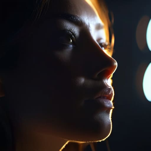
The three-point lighting technique is essentially the “standard way to speak” in visual design. If you’re just throwing a single light source at a scene, you aren’t creating an atmosphere; you’re just creating a mess of harsh, confusing shapes. By using a key light, a fill light, and a backlight for depth, you’re actually giving the player a roadmap. The key light says, “Look here, this is important,” while the fill light softens those aggressive shadows that make a character look like a villain in a low-budget horror flick.
The third light—the rim or backlight—is where the real magic happens for me. Without it, your subjects tend to bleed into the background, making the whole world feel flat and uninspired. It creates a thin sliver of light that separates the player or the object from the environment. It’s the difference between a character feeling like a physical entity occupying a space and a character feeling like a sticker slapped onto a wallpaper. When you nail this, you aren’t just making things visible; you’re telling the player exactly where the world begins and ends.
Backlight for Depth Breaking the Flatness of a Bad Scene

If you’ve only focused on your key and fill lights, you’ve probably noticed something frustrating: your character or subject looks like a cardboard cutout pasted onto a background. Without a dedicated backlight for depth, you’re essentially telling the player that the foreground and the environment are the same flat plane. In game design, we call this a lack of silhouette definition. When you add that rim light behind the subject, you aren’t just “adding light”; you are creating a physical separation that tells the eye exactly where the person ends and the world begins.
This is where a lot of people trip up when they transition from basic setups to something more professional. They think more light equals better quality, but they end up washing out the scene. It’s the same mistake I see in amateur streaming setups—trying to use a massive softbox vs ring light setup to blast everything with brightness, only to realize they’ve killed all the atmosphere. A good backlight shouldn’t be a floodlight; it should be a subtle edge that breaks the flatness of a poorly defined space, giving your scene the three-dimensional weight it needs to actually feel lived-in.
The Designer's Toolkit: Five Ways Lighting Tells the Player What to Do
- Stop trying to illuminate everything. When you light every corner of a room with equal intensity, you’re telling the player that nothing in the environment is special. You aren’t building a world; you’re building a brightly lit hallway. Use shadows to create “negative space” so that when you finally do drop a light source, it actually means something.
- Use color temperature to cheat the player’s emotions. If you want a player to feel safe in a tavern, use warm, low-kelvin tones that mimic firelight. If you switch to a harsh, blue-tinted light in the next room, you haven’t just changed the color palette; you’ve signaled a shift from comfort to tension without writing a single line of dialogue.
- Watch your light’s “budget” against your draw distance. It’s tempting to throw high-end volumetric fog and god rays everywhere, but if your lighting setup tanks the frame rate, you’ve just traded immersion for a slideshow. A clever, low-cost baked lightmap often tells a better story than a real-time light that makes the player’s GPU scream.
- Direct the eye, don’t just decorate the scene. Every light source is a pointer. If there’s a crucial lever or a quest item in a dark corner, and you haven’t placed a subtle rim light or a pool of light near it, you’re essentially forcing the player to play a game of “Where’s Waldo” instead of the game you actually built.
- Check your lighting against the “Silhouette Test.” If you turn your scene into a high-contrast shadow play and the player can’t tell where the floor ends and the enemy begins, your lighting has failed. Good lighting shouldn’t just make things pretty; it should make the mechanical silhouettes of your world readable at a glance.
The Final Light Check
At the end of the day, setting up lighting isn’t about making things look “pretty” in a vacuum; it’s about managing the player’s cognitive load. You’ve used three-point lighting to establish a hierarchy of importance, and you’ve used backlighting to ensure your world doesn’t feel like a cardboard cutout. When you combine these, you aren’t just tweaking sliders in a dev engine; you are directing the player’s eyes through a space. If you skip these steps, you aren’t just saving time—you’re leaving your players to wander through a visual soup where nothing feels significant, and in a game, significance is everything.
I know how tempting it is to just throw a global illumination preset on a scene and call it a day so you can get back to coding the actual mechanics. I’ve been there, staring at a broken combat loop while my environment looked like a blurry mess. But remember: lighting is a silent dialogue between you and the person holding the controller. Every shadow you cast and every highlight you place is a way of saying, “Look here, this matters.” Don’t just build a world; communicate with your players through the light, and you’ll find they stay in your world a lot longer.
Frequently Asked Questions
If I use too much backlight to create depth, am I risking making the player feel like they're playing a game that’s more about looking pretty than actually being playable?
You’ve hit on the exact tension that kills most indie projects. If you overdo the backlight, you aren’t just creating depth; you’re competing with the gameplay for the player’s attention. If the silhouette is gorgeous but the player can’t actually see the enemy’s telegraphs or the item they’re trying to loot, you’ve designed a screensaver, not a game. A beautiful scene that obscures mechanics is just a polite way of telling the player to stop playing and start watching.
How do I balance lighting for atmosphere without accidentally creating a "hidden" mechanic where players can't see important loot or environmental cues?
The mistake is thinking lighting is just “vibes.” If you crank the darkness to build dread, you aren’t just setting a mood; you’re accidentally making “having a high-end monitor” a prerequisite for playing your game. To avoid this, use lighting to create contrast, not just shadows. Keep your critical cues—loot, levers, enemy eyes—in a different luminance bracket than your atmosphere. If the player has to squint to find the objective, your lighting isn’t atmospheric; it’s a barrier.
At what point does a lighting setup stop being a way to guide the player and start becoming a "sentence" that tells them the game is more interested in its own art style than their experience?
It happens the moment the lighting stops being a tool and starts being a barrier. If I can’t see the loot because you wanted a “moody, noir silhouette,” or if I’m squinting at a boss’s telegraphs because they’re lost in a bloom-heavy haze, you’ve stopped communicating with me. You’re no longer saying “look here”; you’re saying “look how cool my shaders are.” When the aesthetic demands the player sacrifice clarity, the sentence has turned into a lecture.

