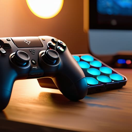
The Complete Guide to Accessibility in Games
Most people treat a “complete guide to accessibility in games” like it’s a checklist of expensive checkboxes to tick off before launch—a series of high-contrast toggles or a way to avoid a PR headache. But if you think accessibility is just about adding a “colorblind mode” to satisfy a corporate mandate, you’re missing the point entirely. When you design a mechanic that relies solely on a specific audio cue without a visual backup, you aren’t just making a “hardcore” design choice; you are writing a sentence that tells a massive portion of your potential community that they aren’t invited to play. I’ve spent enough time staring at broken UI in dead MMOs to know that accessibility isn’t an add-on; it’s the very foundation of how you communicate with your players.
I’m not here to give you a sanitized list of industry buzzwords or tell you how much it “costs” to be inclusive. Instead, I want to talk about the actual mechanics of exclusion and how to fix them without breaking your game’s balance. I’ll be sharing what I’ve learned from my own messy attempts at solo dev—the mistakes that actually cost me players—to show you how to build systems that speak to everyone.
Table of Contents
Visual and Auditory Accessibility Features as Design Sentences

When a dev decides how a spell looks or how a footstep sounds, they aren’t just “adding features”—they are deciding who gets to participate in the core loop. If your boss fight relies entirely on a flashing red screen to signal a wipe mechanic, you’ve written a sentence that says, “If you can’t see this specific frequency of light, you don’t matter.” This is where visual and auditory accessibility features stop being a checklist and start being the actual language of the game. A well-designed UI that uses both high-contrast shapes and distinct audio cues isn’t just being “nice”; it’s ensuring the player’s brain can process the intent of the encounter regardless of their sensory input.
I’ve seen too many indie devs treat this like an afterthought, something to tack on during the final polish phase. But when you ignore inclusive game design principles from the start, you end up with a codebase that’s fighting itself. You can’t just slap a colorblind mode on a game where the entire faction system is based on red vs. green and call it a day. That’s like trying to fix a broken sentence by just changing the font. You have to design the meaning of the information to be redundant, so no single sense is the sole gatekeeper to the fun.
Motor Impairment Gaming Solutions That Actually Work

When we talk about motor impairment gaming solutions, we often default to “button remapping” as if that’s the finish line. But if I’m building a system and I only offer remapping, I’m actually saying: “I expect you to have the same physical dexterity as everyone else, I just don’t care how you trigger the command.” That’s a bad sentence. Real progress happens when you look at the frequency and timing of inputs. If a boss fight requires a rhythmic sequence of precise, rapid-fire button presses, you haven’t designed a challenge; you’ve designed a barrier that effectively locks the door on anyone using assistive technology for gamers.
The goal shouldn’t be to just “add options,” but to bake inclusive game design principles into the core loop. This means things like toggleable holds—where holding a button to charge an ability becomes a single press—or sophisticated input buffering that accounts for a slight delay in physical response. I’ve seen devs try to patch this in later, but it always feels like an afterthought, a clunky layer of code slapped onto a rigid skeleton. When you design for motor accessibility from the start, you aren’t just helping a subset of players; you’re creating a more fluid and forgiving mechanical experience for everyone.
Five Ways to Stop Writing "You Aren't Invited" into Your Code
- Stop treating accessibility as a checklist of toggles and start treating it as a core part of your game’s language. If you add high-contrast modes but keep your UI colors muddy and overlapping, you’re basically shouting a sentence and then immediately whispering the next one; you haven’t actually solved the communication problem, you’ve just added more noise.
- Don’t make players choose between “playing the game” and “playing it accessibly.” If a player has to turn on a specific mode just to see a health bar, you’ve already lost the battle of engagement. The goal is to make the interface so flexible that the player’s way of perceiving the world is seamless, not a series of awkward compensations.
- Watch out for the “Complexity Trap” where you assume a feature is too “hardcore” to be simplified. When you refuse to add a way to skip or slow down a high-intensity button mash because it “ruins the skill ceiling,” you aren’t protecting the game’s integrity; you’re just writing a sentence that says, “This game is only for people with a specific type of fine motor control.”
- Remember that every time you add a shortcut or a remappable key, you are competing with the player’s physical fatigue. A game that requires perfect, repetitive inputs for six hours straight isn’t a test of skill—it’s a test of endurance that excludes anyone with chronic pain or limited mobility. Design for the person playing on their tenth hour, not just the person on their first.
- Test your systems with the assumption that your player’s attention is being pulled in ten different directions. If a player can’t navigate your menus because they are too reliant on a single sensory cue—like a specific sound or a specific color—you’ve built a house of cards. A robust game is one where the “sentence” remains clear even if you take away the player’s ability to hear it or see it in full color.
The Final Sentence

At the end of the day, accessibility isn’t a checklist of features you tack on during the final sprint to avoid a PR disaster. It’s the fundamental architecture of how your players interact with your world. Whether you’re tweaking colorblind modes, refining input remapping, or adjusting how much information a UI spits out at once, you are making a choice about who gets to stay and who gets pushed out. When we talk about visual, auditory, or motor accessibility, we aren’t just talking about “fixing” things for a subset of people; we are talking about refining the clarity of the conversation between the designer and the player. If your systems are too loud, too fast, or too rigid, you aren’t creating “challenge”—you’re just writing a sentence that says you aren’t welcome here.
I spend a lot of time looking at the wreckage of old MMOs and failed indies, and the ones that actually leave a mark are the ones that felt intentional. They understood that a game is a series of invitations. When you build with accessibility in mind from the first line of code, you aren’t just being inclusive; you are building a more robust, more elegant, and ultimately more playable experience for everyone. Don’t wait until your community is screaming at you in a Discord thread to realize your design is exclusionary. Start writing sentences that invite everyone to the table, because the best games are the ones that refuse to leave anyone behind.
Frequently Asked Questions
If I add all these accessibility toggles, am I going to bloat the UI so much that I'm actually making the game harder for everyone else to navigate?
Look, I’ve been there. You start adding toggles and suddenly your HUD looks like a cockpit from a fighter jet. But here’s the thing: accessibility isn’t about adding more stuff to the screen; it’s about giving players the power to decide what matters. If your UI is bloating, you’re not building accessibility, you’re just failing at layout. Design your systems to be modular. A clean UI isn’t a static image; it’s a conversation.
How do you balance accessibility without accidentally breaking the "intended" difficulty or the competitive integrity of a high-stakes raid?
The “intended difficulty” is often just a designer’s way of saying they want to gatekeep a specific feeling of triumph. If a player can’t physically execute a button sequence due to a motor impairment, the difficulty isn’t “high”—it’s just broken. You don’t break competitive integrity by adding an aim assist or a toggleable UI; you break it when you give one player a mechanical advantage that bypasses the actual skill expression you’re trying to measure.
At what point does an accessibility feature stop being a way to include people and start becoming a "crutch" that fundamentally changes the designer's original vision for the game's tension?
It stops being inclusion and starts being a “crutch” the moment you stop designing for the player and start designing for the bypass. If a feature removes the decision rather than the barrier, you’ve rewritten the game’s tension. A way to see a hidden enemy is inclusion; an auto-aim that ignores positioning is a different game entirely. You aren’t helping them play your vision; you’re replacing your vision with a shortcut.

