The Complete Guide to Game Ui
Most “complete guide to game UI” tutorials I find online are just glorified lists of aesthetic trends—telling you how to make a button look “sleek” or “modern” without ever mentioning why that button exists in the first place. They treat interface design like a coat of paint, but I’ve spent too many nights staring at my own broken builds to believe that lie. If your UI is just a collection of pretty icons that obscures the actual gameplay, you haven’t designed an interface; you’ve designed a barrier. Every menu, every health bar, and every cluttered inventory screen is a sentence written to the player, and most of the time, those sentences are accidentally telling them to go play something else.
I’m not here to teach you how to make things look pretty for a portfolio piece. I want to talk about the mechanics of attention and how to build interfaces that actually respect the player’s time. We’re going to strip away the fluff and look at how every pixel competes with the core loop for the player’s focus. This isn’t a textbook; it’s a look at the functional grammar of play, drawn from everything I’ve learned while building my own systems and breaking them in the process.
Table of Contents
Reading the Sentences of Diegetic vs Non Diegetic Ui
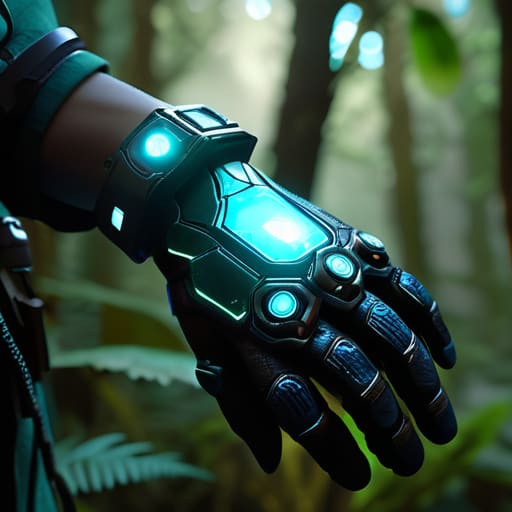
When you look at a screen, you’re reading a conversation between the player and the world. The biggest divide in that conversation is the tension between diegetic vs non-diegetic UI. Diegetic elements live inside the world—think of a character actually looking down at a physical map or checking a holographic wrist display. When a designer pulls this off, they aren’t just showing you data; they are telling you that your character is present in the space. It’s an invitation to stop being a spectator and start being a participant.
But here’s where I usually see developers trip up: they mistake “minimalist game interface design” for “hiding everything.” Just because you aren’t cluttering the screen with bright red health bars doesn’t mean you’ve solved the problem. If I have to squint at a character’s animation to guess if they’re dying because you were too precious about your aesthetic, you haven’t created immersion—you’ve created frustration. A non-diegetic HUD is a tool, not a decoration. If the health bar is floating in the corner, it’s a sentence saying, “I need you to monitor this constant pressure.” If it’s gone entirely, the sentence becomes: “I trust you to feel the stakes through the gameplay alone.” Most devs aren’t brave enough to write that last one.
The Hidden Cost of Poor Visual Hierarchy in Game Menus

When you mess up the visual hierarchy in game menus, you aren’t just making things “ugly.” You’re creating friction. I’ve spent late nights staring at my own dev builds, realizing that when a player opens an inventory screen and can’t immediately find the ‘Equip’ button because a flashy, useless icon is screaming for attention, I have failed them. You’re essentially handing them a manual written in font size 4 during a thunderstorm. Every time a player has to pause their momentum to hunt for a basic function, you are competing with the actual game for their focus—and usually, you’re losing.
This is where the real cost of bad UX hits. It’s not just a momentary annoyance; it’s a tax on their cognitive load. If your player feedback and interface responsiveness are buried under layers of visual noise, the player stops feeling like a hero and starts feeling like an administrator. They stop playing the game and start managing the software. I learned this the hard way while building my own project: if the menu feels like a chore, the gameplay will eventually feel like one too.
Five Ways to Stop Your UI From Arguing With Your Players
- Respect the player’s cognitive load by treating every icon as a decision. If you cram twenty different ability icons into a single HUD bar without any visual distinction, you aren’t giving them “options”—you’re giving them a math problem to solve in the middle of a boss fight. Every time a player has to squint to find their health bar, you’ve lost a micro-second of their focus, and in a high-stakes game, those micro-seconds are the difference between a win and a “rage quit.”
- Stop using “aesthetic” as an excuse for illegibility. I see this constantly in indie builds where developers want a super minimalist, thin-font look to feel “prestige,” but it ends up competing with the actual game world for clarity. If your UI font is so thin that it disappears against a snowy backdrop, you’re telling the player that your art direction is more important than their ability to play the game.
- Audit your menu depth like you’re auditing a guild bank. If it takes more than three clicks to reach a core loop—like upgrading a skill or checking gear—you’ve built a wall, not a bridge. A deep, nested menu system is a sentence that says, “We want you to spend more time navigating than playing,” and players are incredibly good at sensing when you’re trying to pad your engagement metrics with friction.
- Give your UI a sense of “weight” through feedback. A button shouldn’t just change color when clicked; it should feel like it belongs to the world you built. If your game is a gritty, low-fantasy survival sim but your menu sounds like a cheerful mobile puzzle game, you’re breaking the immersion contract. The UI needs to speak the same language as the combat, or the player will never truly feel “in” the game.
- Design for the “panic state.” Most developers build UI for when the player is standing still in a safe zone, which is easy. The real test is how that UI performs when the player is at 5% health, being chased by a mob, and trying to pop a potion. If your UI requires precision clicking during a chaotic encounter, you haven’t designed a tool; you’ve designed an obstacle.
The Final Syntax Check
At the end of the day, a UI isn’t just a collection of buttons and progress bars; it is the primary way you communicate your intentions to the player. We’ve looked at how diegetic elements can pull a player deeper into the world, and how a messy visual hierarchy can accidentally tell them that their time is an infinite resource you don’t care about respecting. Whether you are choosing between a clean HUD or a fully immersive interface, remember that every pixel is competing with the player’s desire to actually play the game. If your menus are fighting the gameplay for attention, you haven’t built a tool; you’ve built a barrier to entry.
As I sit here staring at my own half-finished builds, trying to figure out why my crafting menu feels like a chore rather than a reward, I’m reminded that good UI is often invisible. It’s the silent dialogue that says, “I understand what you’re trying to do, and I’m here to help.” Don’t just design for aesthetics or follow the latest trends in minimalist art; design for the logic of the player’s intent. When you finally get it right, the player won’t praise your UI—they’ll simply forget it’s there because they were too busy living in the world you built. That is the ultimate goal.
Frequently Asked Questions
If I'm building a small-scale game alone, how do I know when to lean into a clean, minimal UI versus when a "cluttered" MMO-style interface is actually what the players are craving?
You have to ask yourself what you’re asking the player to do. If your game is about flow and presence—like a soulslike or a platformer—clutter is a loud, distracting scream that breaks the spell. But if you’re building an economy or a tactical sandbox, “clutter” is actually just information density. Players in those genres aren’t looking for minimalism; they’re looking for agency. They want to see every lever and gear so they can master them.
How do you balance making a UI diegetic and immersive without accidentally making the most important gameplay information impossible to find during a high-stress moment?
You’re walking a tightrope between “cool atmosphere” and “why am I dead?” If you go full diegetic, you’re telling the player that aesthetics matter more than survival. That’s a lie, and players hate being lied to when their heart rate is at 140. The trick is layering. Use diegetic elements for flavor, but keep your critical telemetry—health, cooldowns, threat—in a high-contrast, non-diegetic “safety layer.” Don’t let your immersion compete with the player’s ability to react.
At what point does a "systemic" UI—like a complex skill tree or an inventory management screen—stop being a way to engage players and start becoming a chore that's just competing with the actual game?
It stops being engagement the second the player stops thinking about their character and starts thinking about the menu. If I’m looking at a skill tree and I’m not weighing a tactical trade-off, but instead just trying to figure out which icon is the “correct” one to click to stop the clutter, the system has failed. You’ve stopped designing a choice and started designing a chore that’s competing with the actual game for their brainpower.

